iOS 26's "Liquid Glass": A Design Revolution or a Visual Headache?
Apple's recent unveiling of iOS 26 introduced a radical new design language dubbed "Liquid Glass," promising a more fluid, immersive, and visually dynamic user experience. But as users have started to get their hands on it, particularly those vocal communities on Twitter and Reddit, the reception has been anything but unanimous. It seems "Liquid Glass" is either a stroke of design genius or a visually jarring misstep, with very little in between.
The Sparkle and Shine: What Users Love
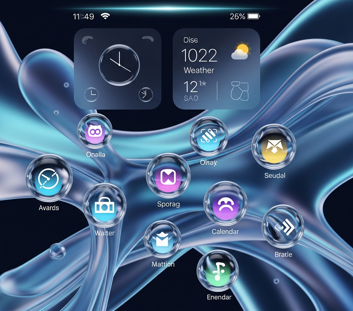
For those who embrace it, "Liquid Glass" is nothing short of a breath of fresh air. Admirers frequently use words like "gorgeous," "phenomenal," and "fresh" to describe the new aesthetic. They appreciate the translucent, glass-like elements that permeate the OS, from app icons to navigation bars, and how these elements react with a subtle, fluid motion to user interaction and screen content.
"My iPhone feels alive again! The animations are so expressive, and everything just flows. It's truly beautiful." – A Reddit user
Some initially skeptical users have even found themselves won over after spending a few days with the new design, suggesting there's a learning curve to truly appreciating its nuances. It's seen as a bold leap forward, injecting new energy and modernity into the familiar iOS interface.
The Cracks in the Glass: Where Users Struggle
However, the enthusiasm is far from universal. A significant portion of the user base has voiced strong criticisms, often labeling the design as a "disaster," "cartoonish," or a regrettable departure from Apple's signature clean and minimalist aesthetic. The complaints tend to coalesce around several key areas:
Readability and Usability Concerns
One of the most pervasive criticisms revolves around legibility. Many users report that the translucent, often shifting backgrounds make text and icons difficult to discern. This issue is particularly pronounced for those using Dark Mode or dynamic wallpapers, where the visual "noise" can overwhelm the primary content.
"Trying to read notifications with Liquid Glass is a nightmare. Everything blurs together, and my eyes are constantly straining." – A Twitter user
Performance Headaches
For some, especially those with older iPhone models, the aesthetic changes come with a performance cost. Reports of "laggy animations" and "increased battery drain" suggest that the visually intensive nature of "Liquid Glass" might be too demanding for less powerful hardware, leading to a less-than-smooth experience.
Inconsistent Implementation
Another point of contention is the perceived inconsistency of the design language. While "Liquid Glass" is intended to be system-wide, many users note that it doesn't always apply uniformly across all native apps, and third-party applications often fail to integrate with it, leading to a "fragmented and jarring" user experience.
Physical Discomfort: A Surprising Side Effect
Perhaps the most alarming feedback comes from users experiencing physical discomfort. A notable number of individuals have reported symptoms like "dizziness, nausea, or eye strain" due to the constant motion, shifting transparencies, and dynamic visual effects. This suggests that what is intended to be a fluid experience can, for some, become an uncomfortable one.
Finding Clarity: Mitigating the Effects
Recognizing some of these early concerns, Apple reportedly toned down certain aspects of the "Liquid Glass" effect before the final release of iOS 26. Furthermore, users who are struggling with the new look have discovered workarounds using existing accessibility settings. Options like "Reduce Transparency" and "Increase Contrast" are frequently recommended to lessen the visual intensity and improve readability.
The "Liquid Glass" design in iOS 26 is undoubtedly a bold move from Apple. While it has captivated many with its fresh, dynamic aesthetic, it has also alienated others due to usability, performance, and even physical comfort concerns. As with many significant design shifts, it may take time for users to adapt, or for Apple to further refine, what might be its most divisive visual update in years.